Case Study: Business Logo & Website Design
This project was an exercise in UI/UX design in which I imagined a client and new business scenario: a pottery studio and plant shop. The clients are two friends who turned their pop-up business to a brick and mortar shop and needed a website to promote their products and services. In the end, I created a logo and responsive web page design to meet the clients’ overall aesthetic interests.

Design Process – logo
The original business name was Pots n’ Plants as you can see in the first thumbnails and rough drafts. As I continued through the iterative creative process, I thought the name Terra Cotta was a better idea because it is the common clay used to make many traditional pots. Revision was key in this overall process, and in the end, many interesting potential logo ideas emerged.
Design Process – website aesthetic
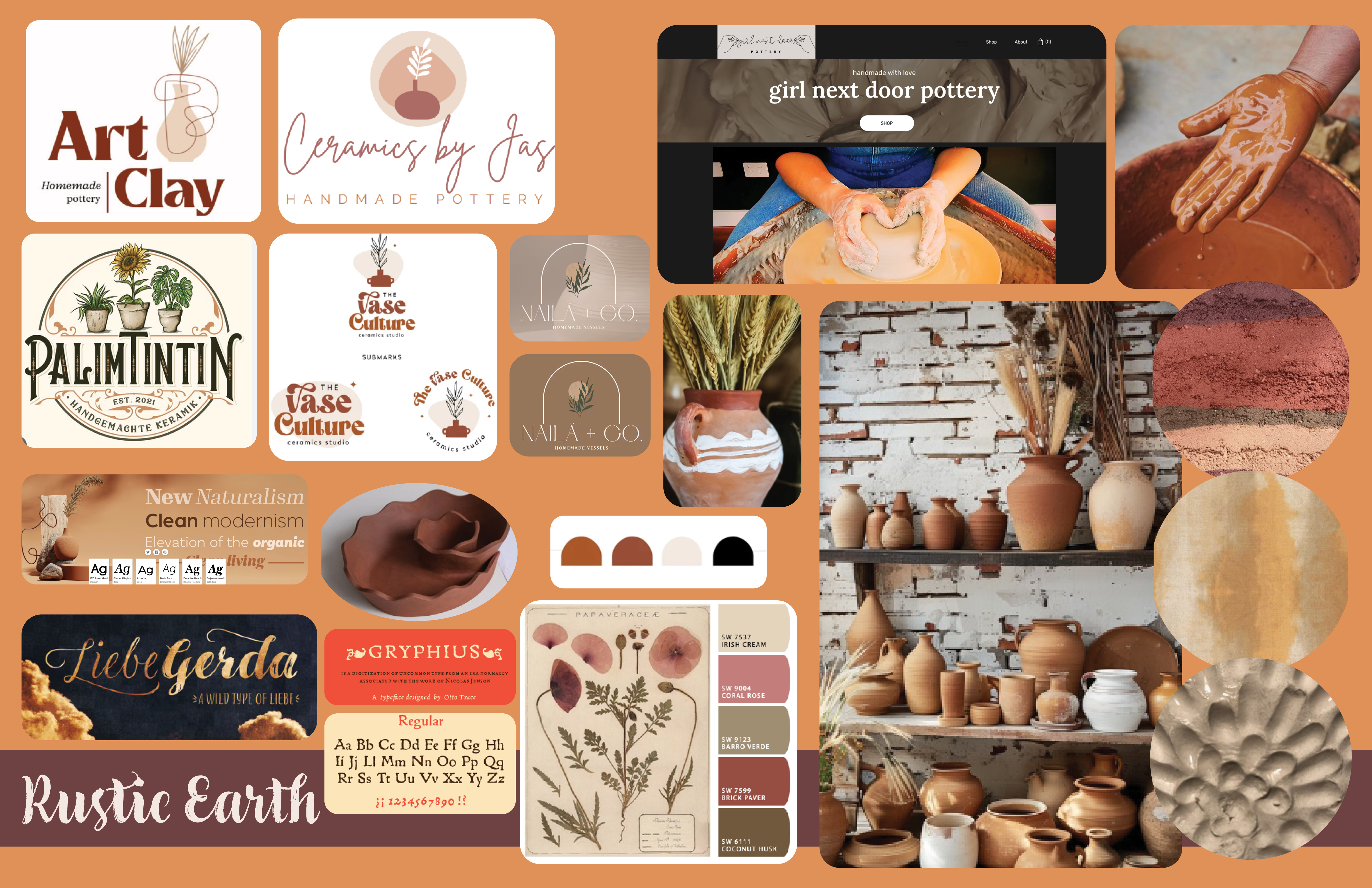
Part of this assignment required the final design to capture a specific niche aesthetic. My imagined clients were into Cottagecore, which ultimately influenced the final design of the logo and website. The use of mood boards aided in researching this specific aesthetic and helped me settle on a more rustic color scheme, which tied in with pottery-related elements.


For the web page design, I started with wireframe thumbnails and rough drafts to determine the overall layout. I tried a few variations during the prototype phase.

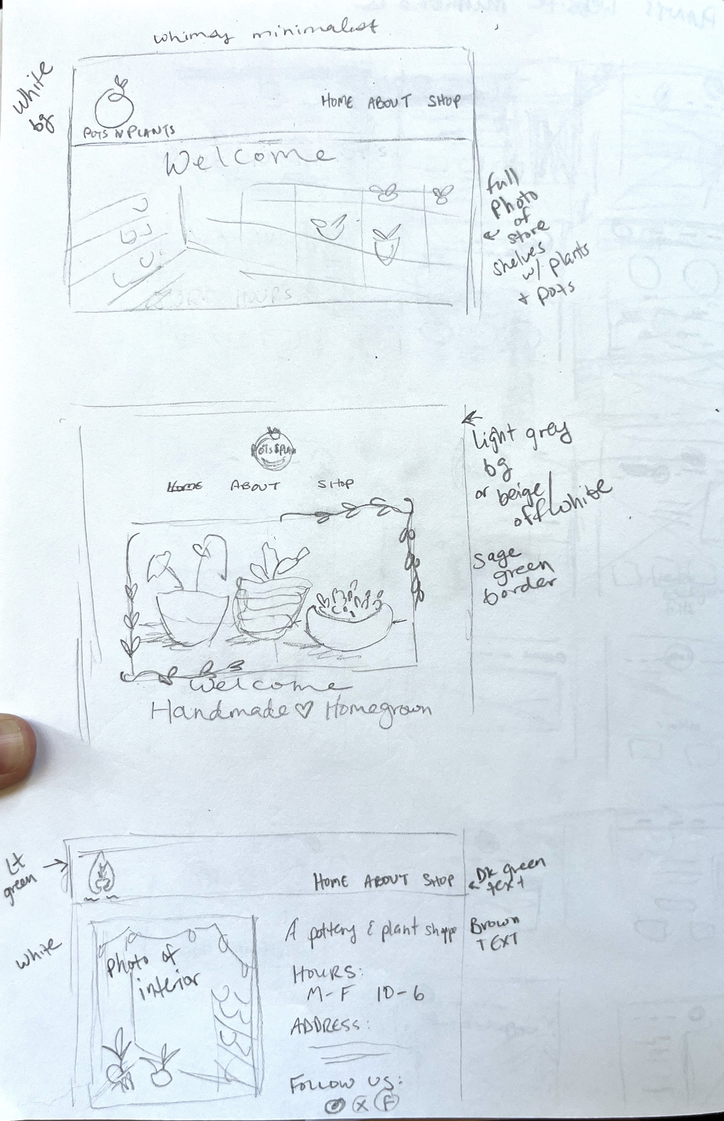

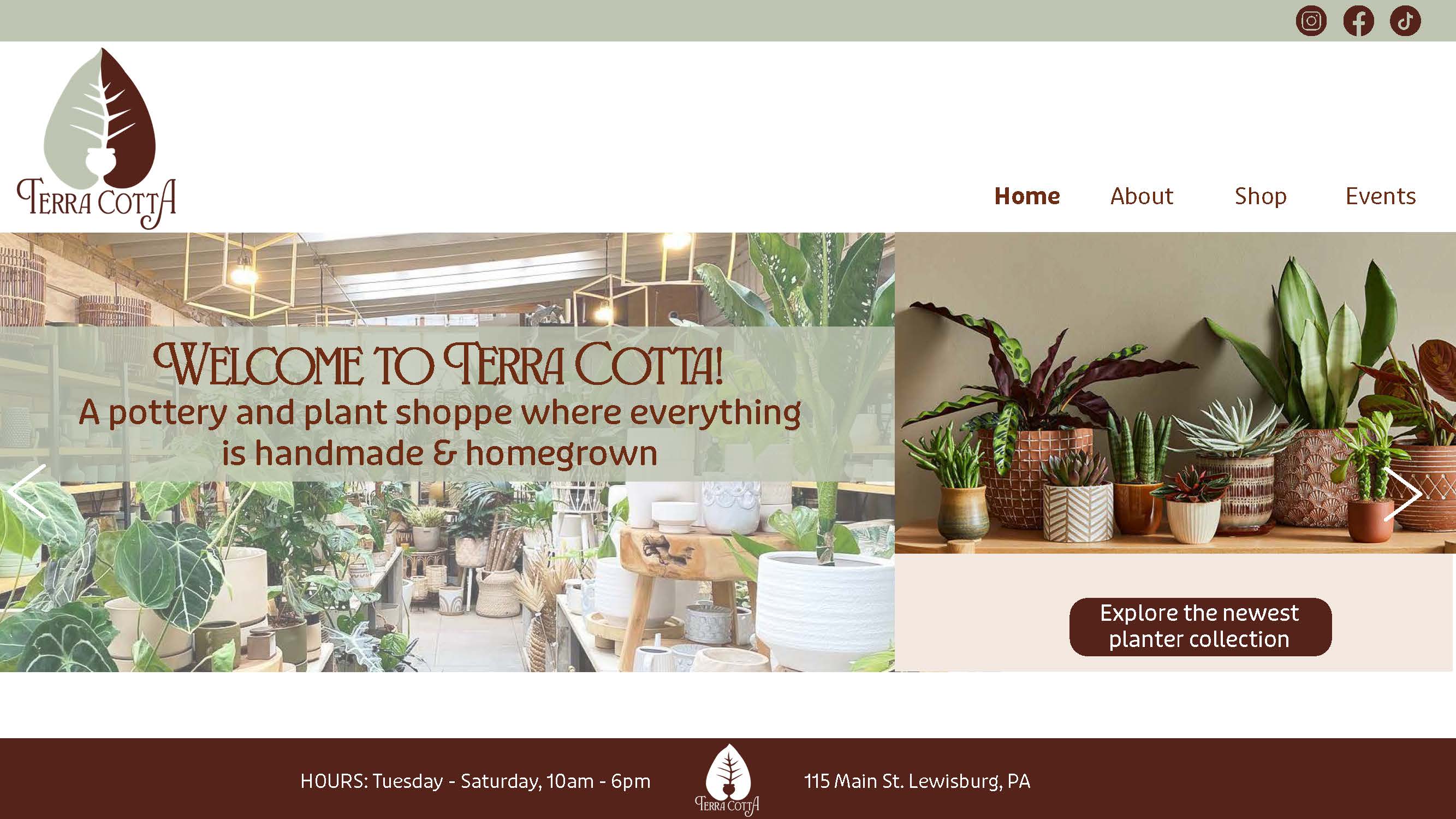

To adhere to the Cottagecore aesthetic, I decided to incorporate some handmade elements, such as a watercolor painting of the storefront or the interior of the shop. The images used were generated with Adobe’s AI feature, but in a real situation, I would create these myself and use photos from the actual shop.


Leave a comment