Case Study: Logo & Brand Design

For this project, I was tasked with creating an original logo and identity kit for a business. The identity kit includes a logo, letterhead, envelope, and business card design. I used this opportunity to redesign a logo I had previously created for a commission project, aiming to hone my minimalist design skills and establish a more cohesive brand style for this nonprofit.
Original Design Process – Watercolor illustration
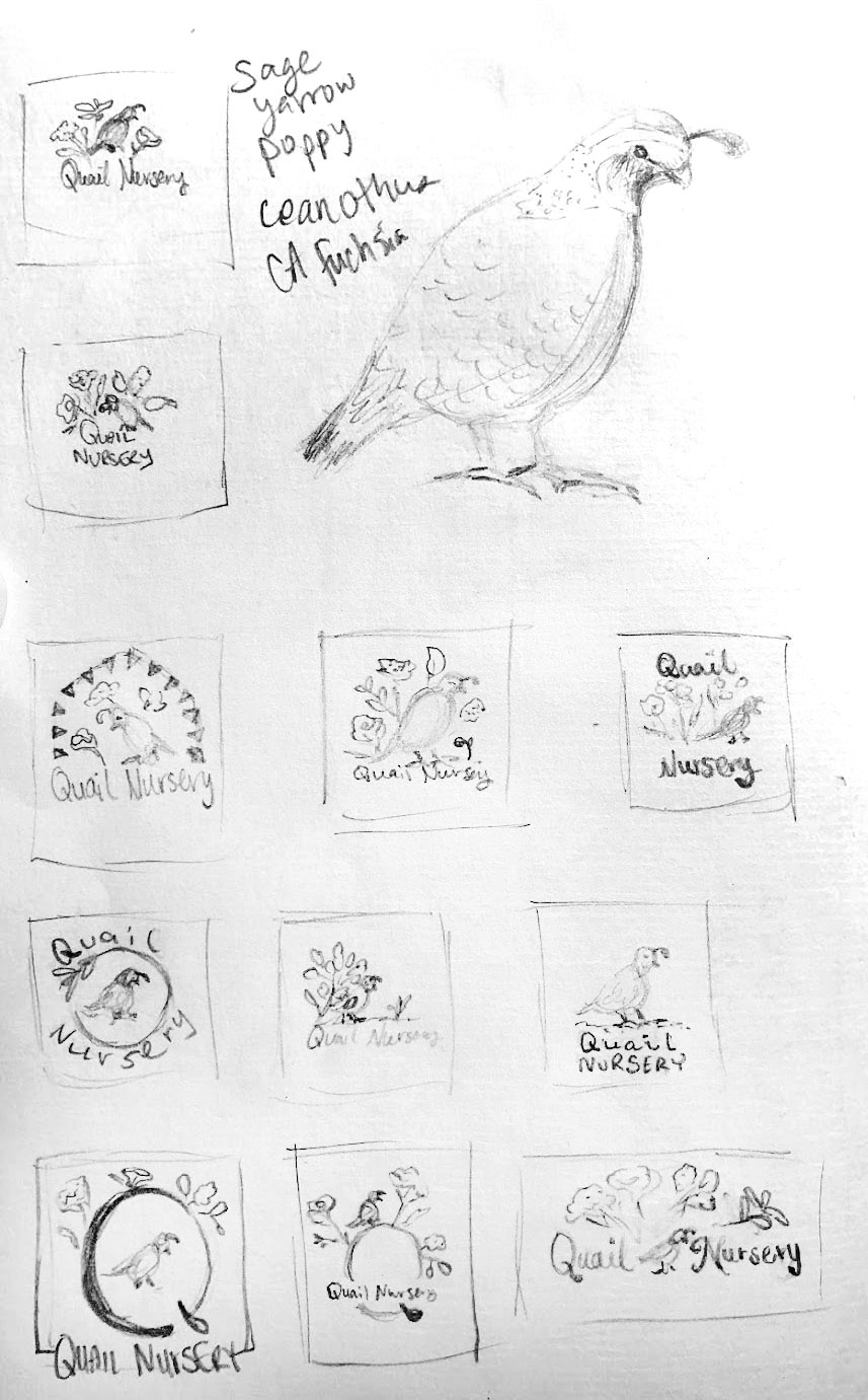
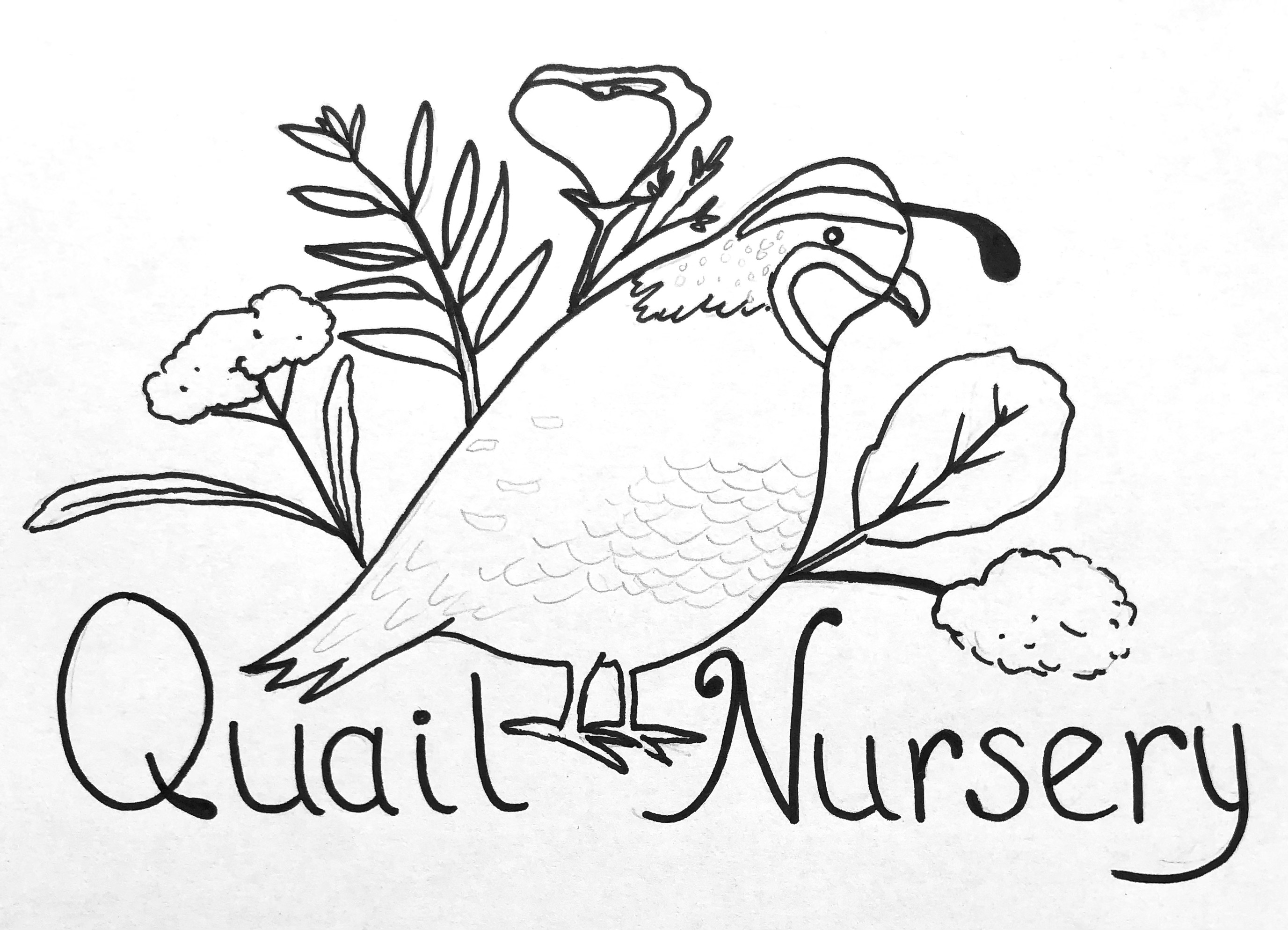

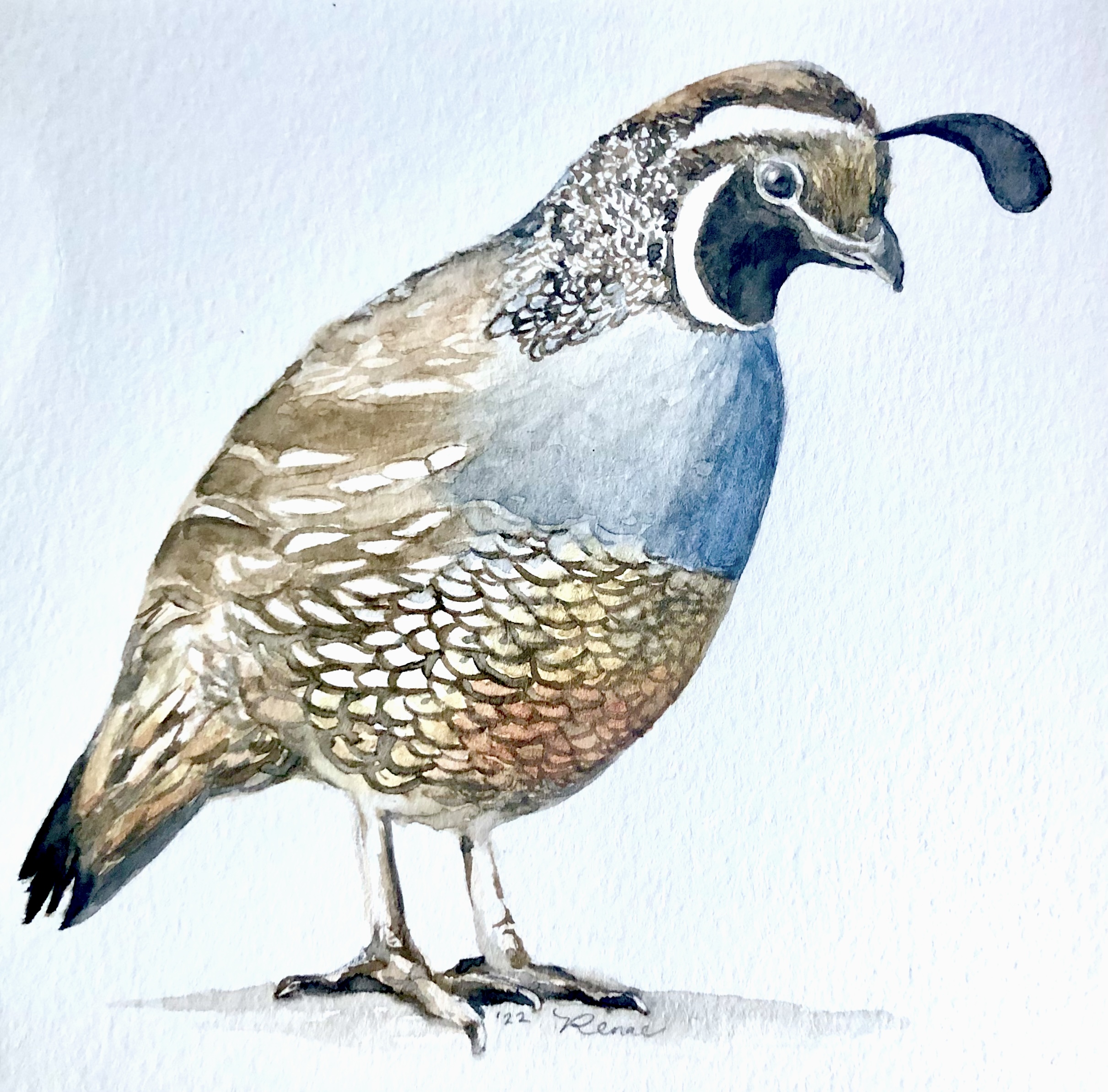
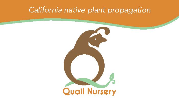
The original logo for Quail Nursery was commissioned by a friend of mine who started a non-profit plant nursery. The client initially wanted to feature multiple California native plants and the state bird, a quail. I created all elements by hand at first, with watercolor and pen, then digitized them into an artistic logo using Photoshop and Illustrator. The final logo design below is what we went with at first:
Logo Redesign Process
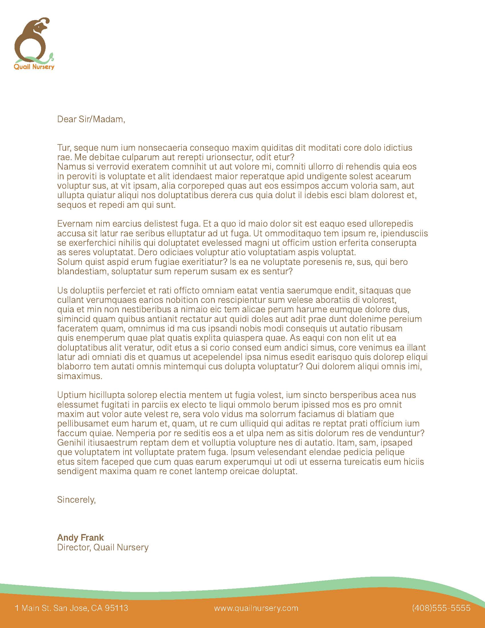
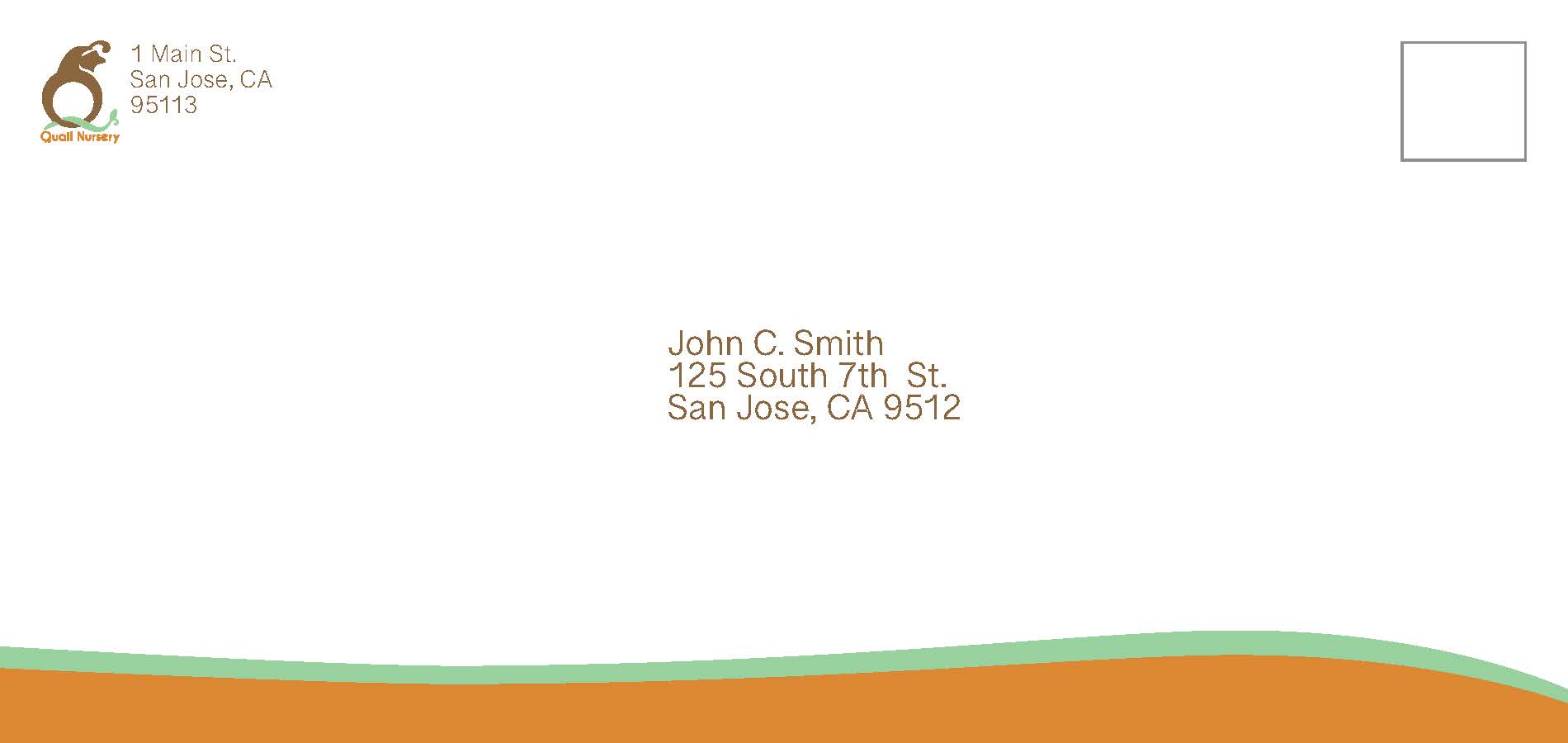
This logo redesign showcases the transformation of my original, painterly concept into a clean, modern, and versatile branding element. Using skills from a graphic design course, I refined the logo into a minimalist design featuring a quail emerging from the letter “Q.” I maintained the client’s preferred color palette (green, orange, and brown), and selected a more professional typeface to replace the original hand-lettering, improving both clarity and usability across formats.


Leave a comment